02 · Tableau · Personal project
Bridges to Prosperity
A source-level redesign of an existing Tableau workbook into finished Global and Rwanda dashboards, with visual hierarchy and analytical structure rebuilt around the questions the data should answer.
Tableau · Visual analytics · Data visualisation design
What this is
The original workbook came from a 2020 Makeover Monday exercise — a brownfield redesign of an existing packaged Tableau workbook rather than a new build from a blank canvas. The packaged TWBX was unpacked, inspected and brought under Git source control before any modification.
The design question was analytical, not cosmetic: what should each dashboard answer first, and what visual hierarchy makes that answer unavoidable? The delivery question was technical: how far could a Tableau workbook be developed at source level and still survive the return journey into Tableau Desktop?
The starting point
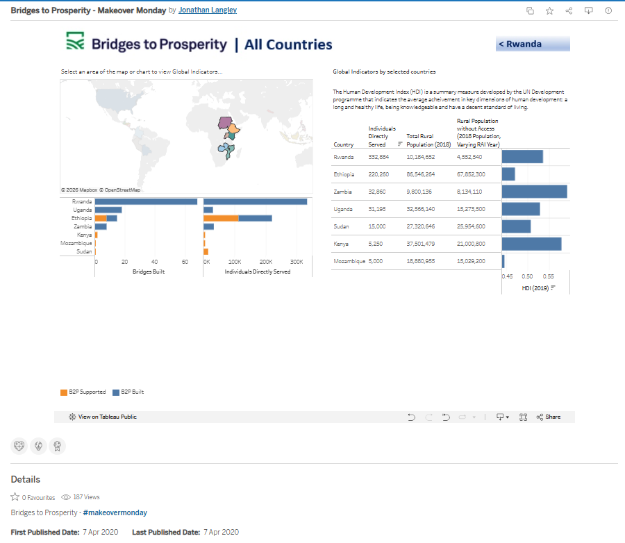
The original workbook already contained genuine analytical structure, navigation and multiple views. That made it a useful test — the question was whether source-level development could improve a real Tableau artefact.
What changed — and why
A headline KPI structure
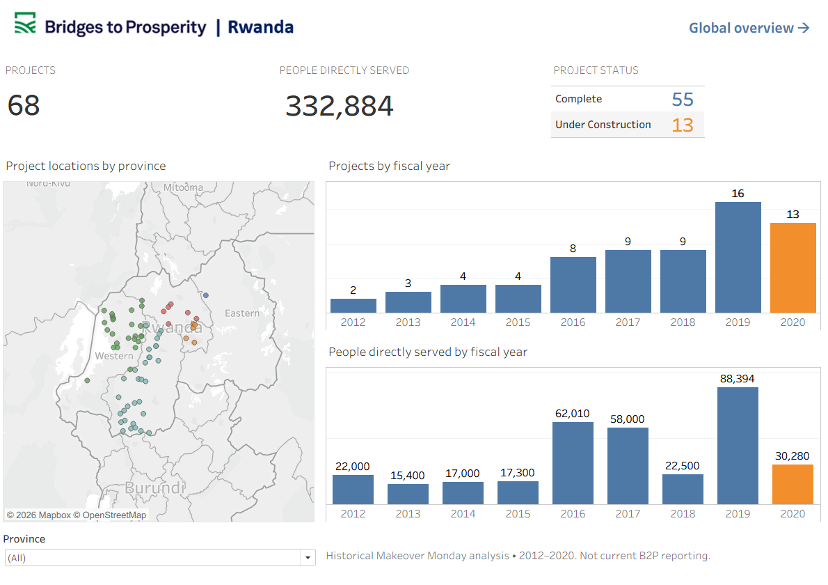
Rwanda was rebuilt around a clear set of programme metrics, so the scale of delivery reads immediately rather than being assembled by the viewer.
Reconstructed dashboard layout
Project and year views were revised and integrated with the existing Province filter, so geography and delivery over time can be read together.
Global reach given a proper hierarchy
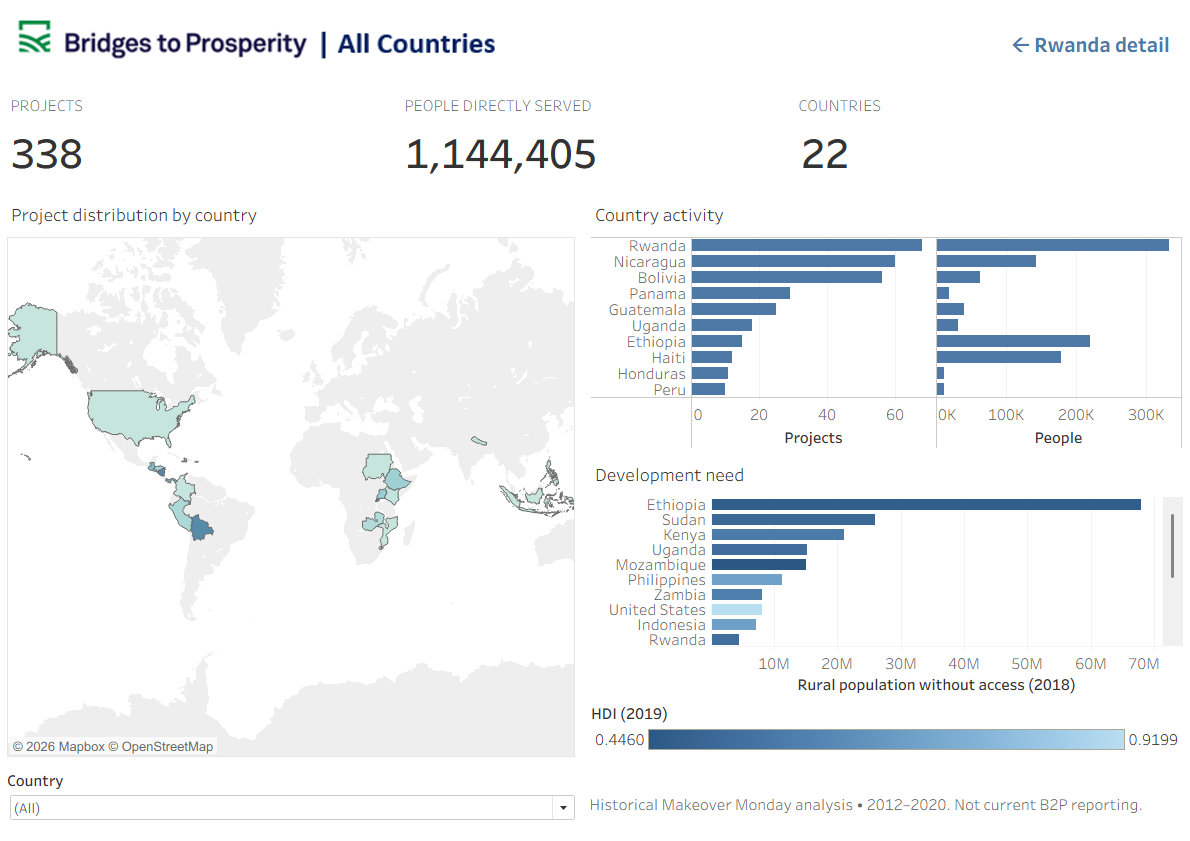
The global view was restructured around project distribution, country activity and development context as three legible layers rather than competing panels.
Source-level development, human validation
AI was used to inspect and modify workbook source and iterate quickly. Opening the result in Tableau Desktop, judging whether it genuinely rendered correctly, and deciding when to stop remained human decisions.
What it showed
Source-level modification produced a materially redesigned Rwanda dashboard that Tableau Desktop opened and rendered correctly. A more ambitious global redesign passed static validation and opened without repair, yet behaved badly — the world map collapsed and several views did not work as expected.
Valid Tableau XML is not valid Tableau visualisation behaviour. Both finished dashboards were completed in Tableau Desktop, which is where the judgement about whether a visualisation actually works still has to be made.
Scope
A personal project, not a client engagement. Based on a publicly available Bridges to Prosperity dataset and a 2020 Makeover Monday workbook; no affiliation with the organisation is implied.