01 · Power BI · Personal project
Haven Warranty Analytics
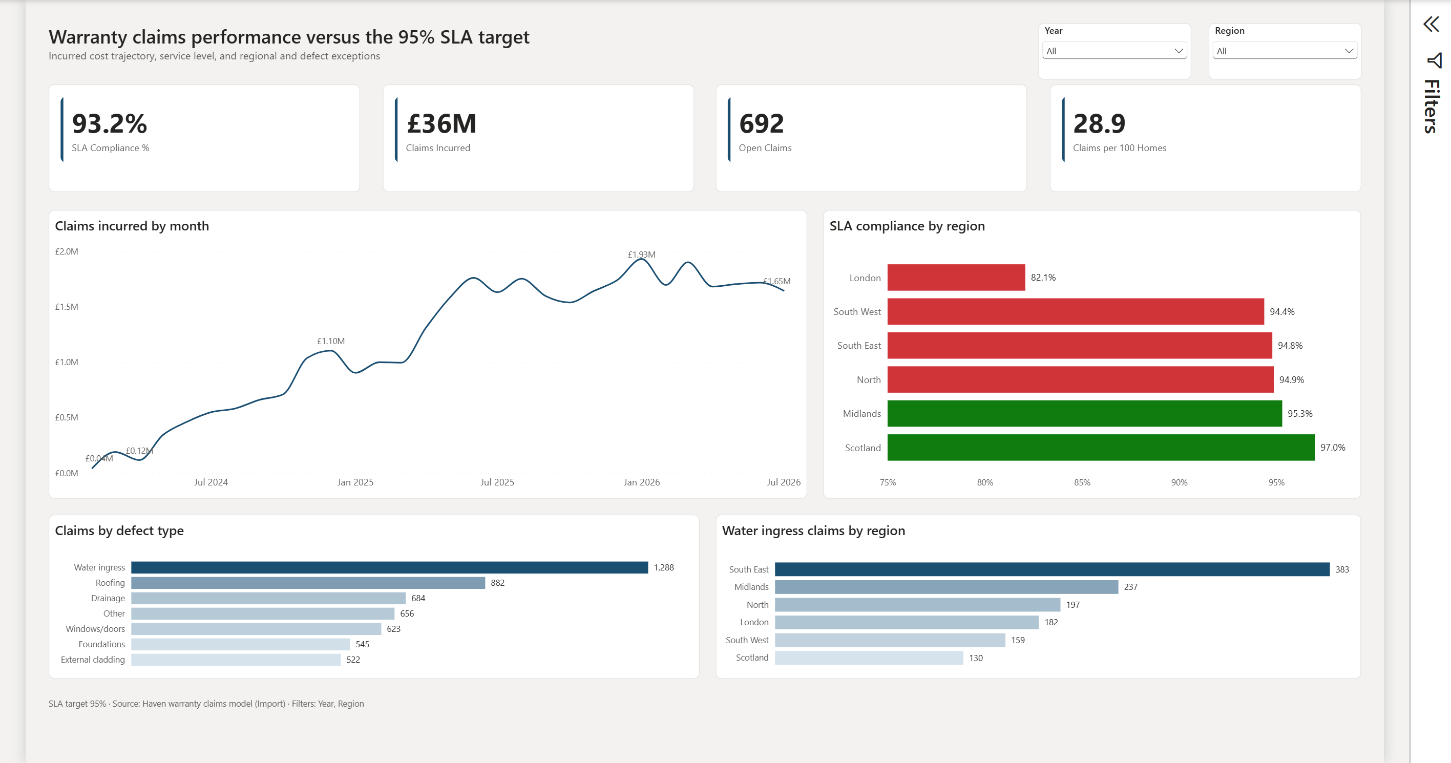
Rebuilding a functional Power BI warranty and claims report into an executive, exception-led management dashboard: a clearer KPI hierarchy, an explicit 95% SLA reference point and regional exceptions surfaced for attention.
Power BI · PBIP/PBIR · TMDL · DAX
What this is
Haven began as a functional Power BI warranty and claims dashboard. The objective was to redesign it into a clearer executive management view — improving the KPI hierarchy, making service performance easier to interpret, and surfacing the exceptions that actually need attention.
The project also became a test of an AI-assisted development workflow: working directly with Power BI project source, iterating on visual and analytical decisions, and retaining human judgement over what belonged in the dashboard.
The starting point
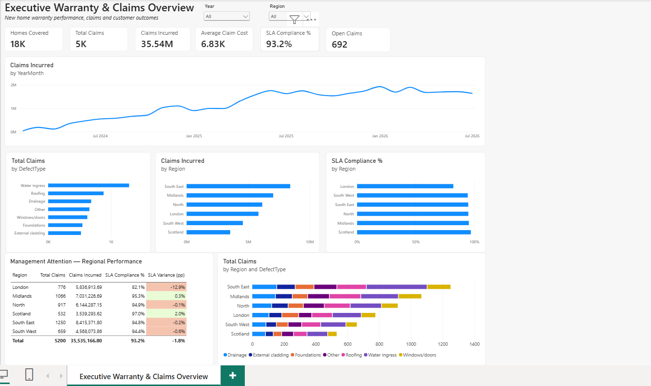
The original report contained the core information, but the visual hierarchy treated many elements with similar importance. The redesign focused on making the management questions clearer rather than simply restyling what was there.
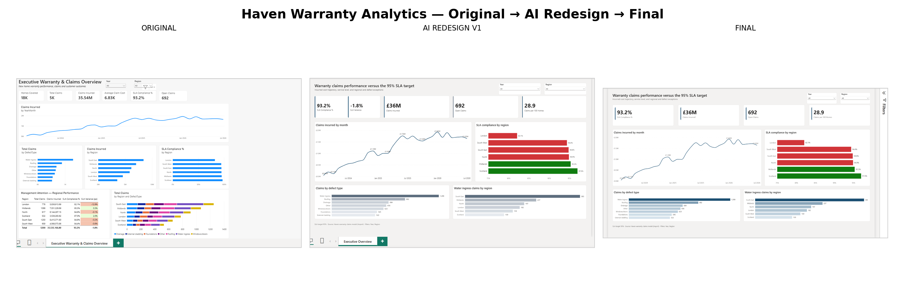
Original → AI redesign → final
What changed — and why
Simplified the KPI hierarchy
Reduced competing visual elements so the most decision-relevant measures are immediately visible.
Made the 95% SLA target explicit
Service performance was redesigned around a clear management reference point rather than an unanchored percentage.
Led with exceptions
Regional performance was restructured so the areas falling short are the first thing a reader sees, not something to be hunted for.
Kept analytical control with the human
AI produced a strong first interpretation of the intended visual language; analytical review, UX refinement and technical validation produced the finished dashboard.
Scope
A personal project, not a client engagement. Built on warranty and claims data for a fictional organisation, using Power BI project source (PBIP/PBIR), TMDL and DAX.